Bluestone
This project aimed to redesign the Bluestone website, involving a team of two UX researcher and two UX designers over a one-and-a-half-month period. I was actively involved in the entire process, from research to prototyping, ensuring that every aspect of the redesign met our objectives. This work was undertaken during my time at Clay Design Strategy.
Setting the Stage
Bluestone has established itself as a prominent player in the indian jewellery market
Renowned for its dedication to exceptional design and craftsmanship. The brand has successfully merged the rich heritage of traditional jewellery with contemporary styles, appealing to a broad audience. Bluestone has embraced technological advancements to enhance its product showcase and customer experience.
Design Scope
How can we enhance the Bluestone website to offer a seamless jewellery browsing and shopping experience?
After our analysis, the team recognised significant potential in using the existing Bluestone website as the foundation for the redesign. While minor updates were necessary throughout the site, the core focus of our project was to seamlessly integrate key improvements for an enhanced shopping experience.
User Research
Understanding customer preferences while
jewellery shopping
Project Goals
Aim is to enhance the overall jewellery browsing and shopping experience by addressing both business and user goals.
Brainstorming & Sitemap
Generating multiple ideas for transforming the shopping experience
BUSINESS GOALS
Through the metrics provided by Bluestone, we discovered that a significant number of men are also purchasing jewelry, which was somewhat unexpected, alongside our core female customers. To gain deeper insights, we conducted interviews with both men and women who are interested in jewellery, exploring their preferences, motivations, and shopping habits.
We brainstormed a few solutions and the following are areas we were exited about and ultimately built upon.
Solution
Homepage
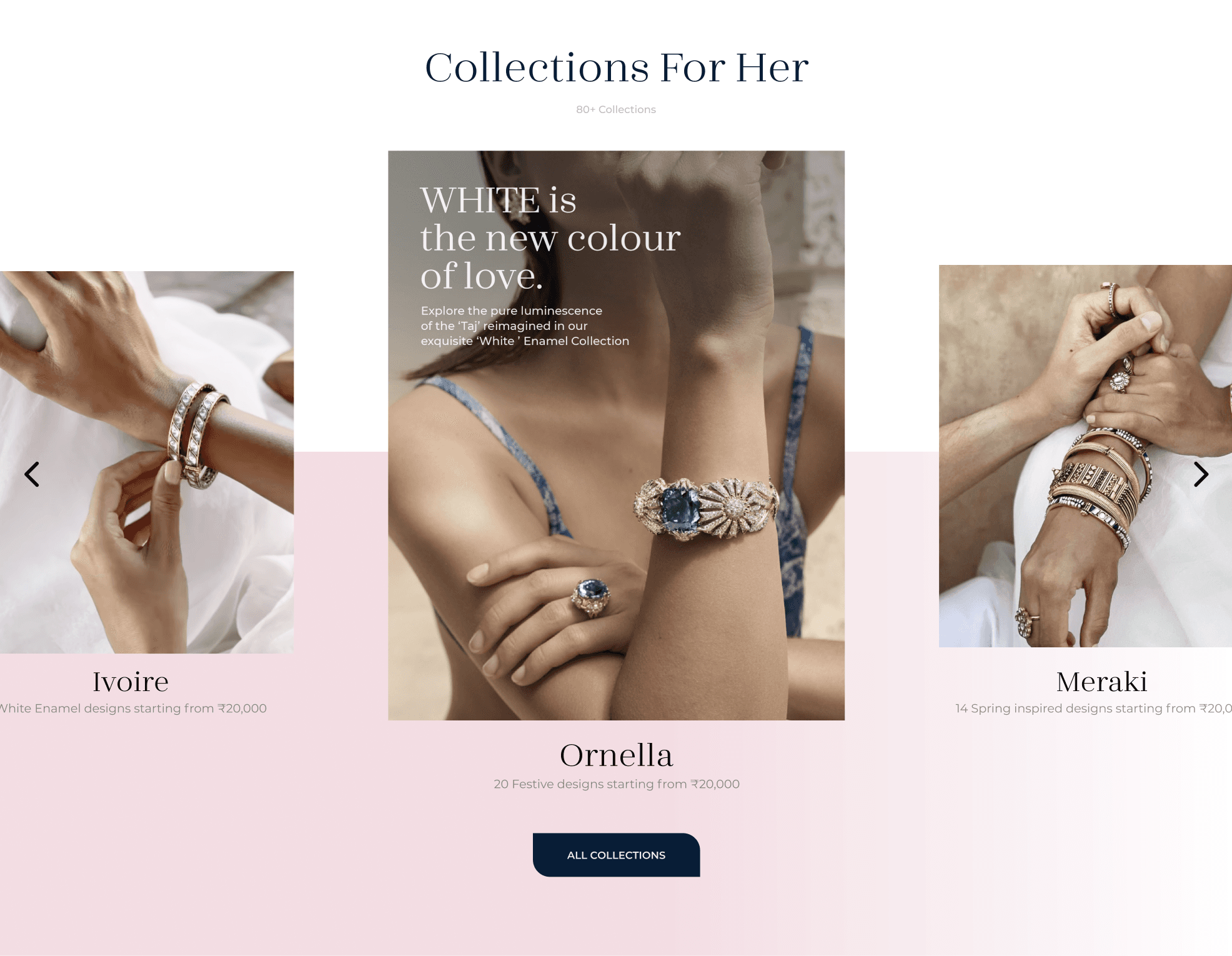
Enhanced the homepage by cleaning up and spacing out the menu bar. Added tabs for Collections, Gifting, Style Hub, and Stores to the top menu bar for quick access. Converted the Collection section into a carousel instead of a long vertical scroll, preventing the site from feeling like an aggregator website.
This section reinforces the brand's vision and promise by inspiring people to invest in love through "Shop Moments of Love". It encourages customers to celebrate special occasions with meaningful jewellery.
Product Listing


Below is a video showcasing the entire homepage, along with a Figma prototype link for a detailed view. Following that, you'll find a detailed description of a few key sections.


Revamped the product listing page to enhance its aesthetics and functionality. It now features sections like "Trending in This Category" and "Stylist's Pick" for easier navigation. A wider range of filters is available to help users find the perfect product. While collection and Goldmine posters remain, they are integrated in a way that doesn't disrupt the page's flow.

The Style Hub is a new feature where you can explore how influencers, actors, and other fashion-forward individuals have styled Bluestone jewellery. It aims to increase sales and enhance customer engagement by providing inspiration and ideas for incorporating Bluestone pieces into your own wardrobe.
Collections are now displayed in a horizontal scroll with an option to view all, instead of the previous vertical layout that filled more than half of the homepage. This change frees up valuable space, allowing us to showcase other products, enhance discoverability, and build trust with our customers.
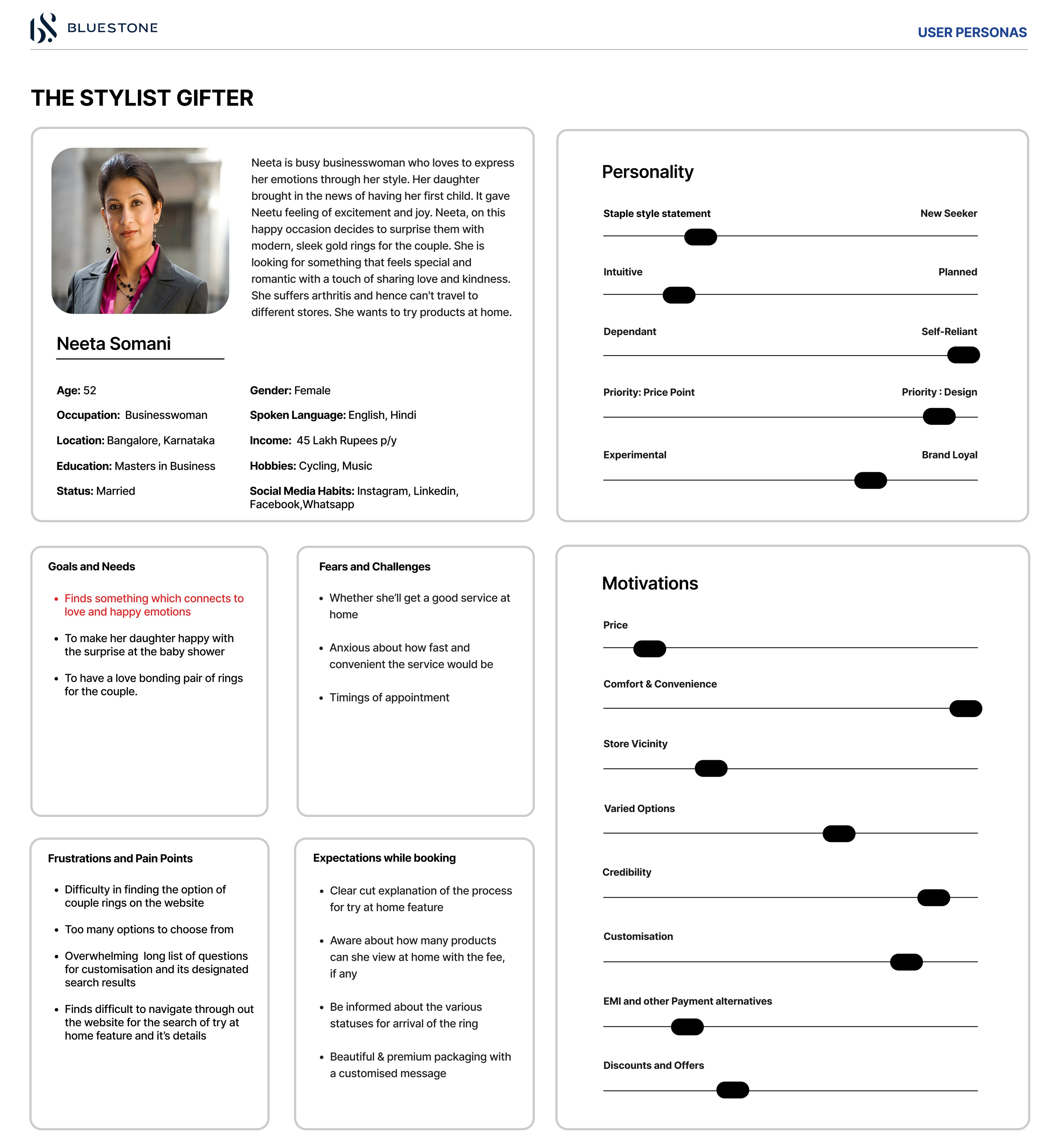
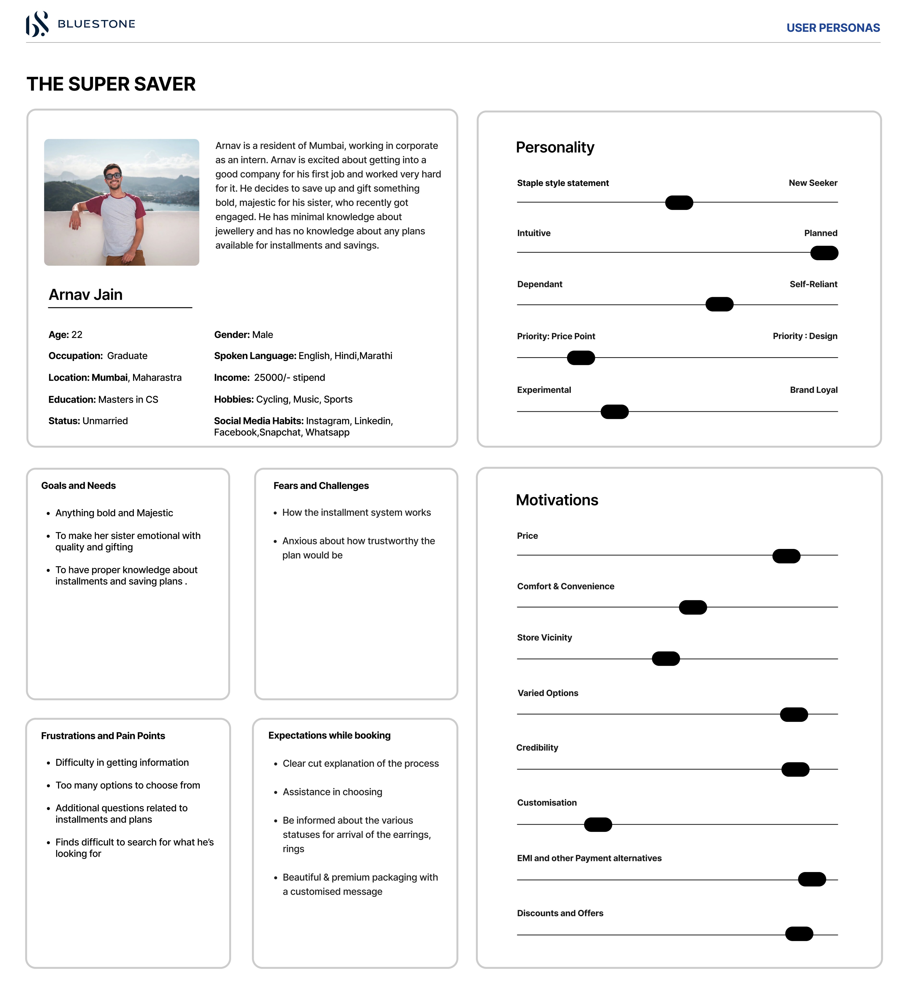
User Personas
After talking to people, we identified various customer types and created user personas for each one.

🔎
Improve discoverability by enhancing the visibility of our product range, categories, designs, craftsmanship, and services like Goldmine.
Improve Discoverability
✨
Reaffirm the confidence of our current users and establish trust with new users.
Build Trust and Loyalty
💪🏽
Align the website with Bluestone’s branding as a “lovesmith,” emphasizing the idea of investing in love and building meaningful relationships with customers.
Strengthen Brand
Identity
💻
Create a unified shopping journey that integrates both online and offline experiences, ultimately driving greater sales.
Seamless Integration
USER GOALS
🛍️
Provide users with an intuitive and engaging platform that makes exploring and purchasing jewellery enjoyable and hassle-free.
Enhanced Shopping
Experience
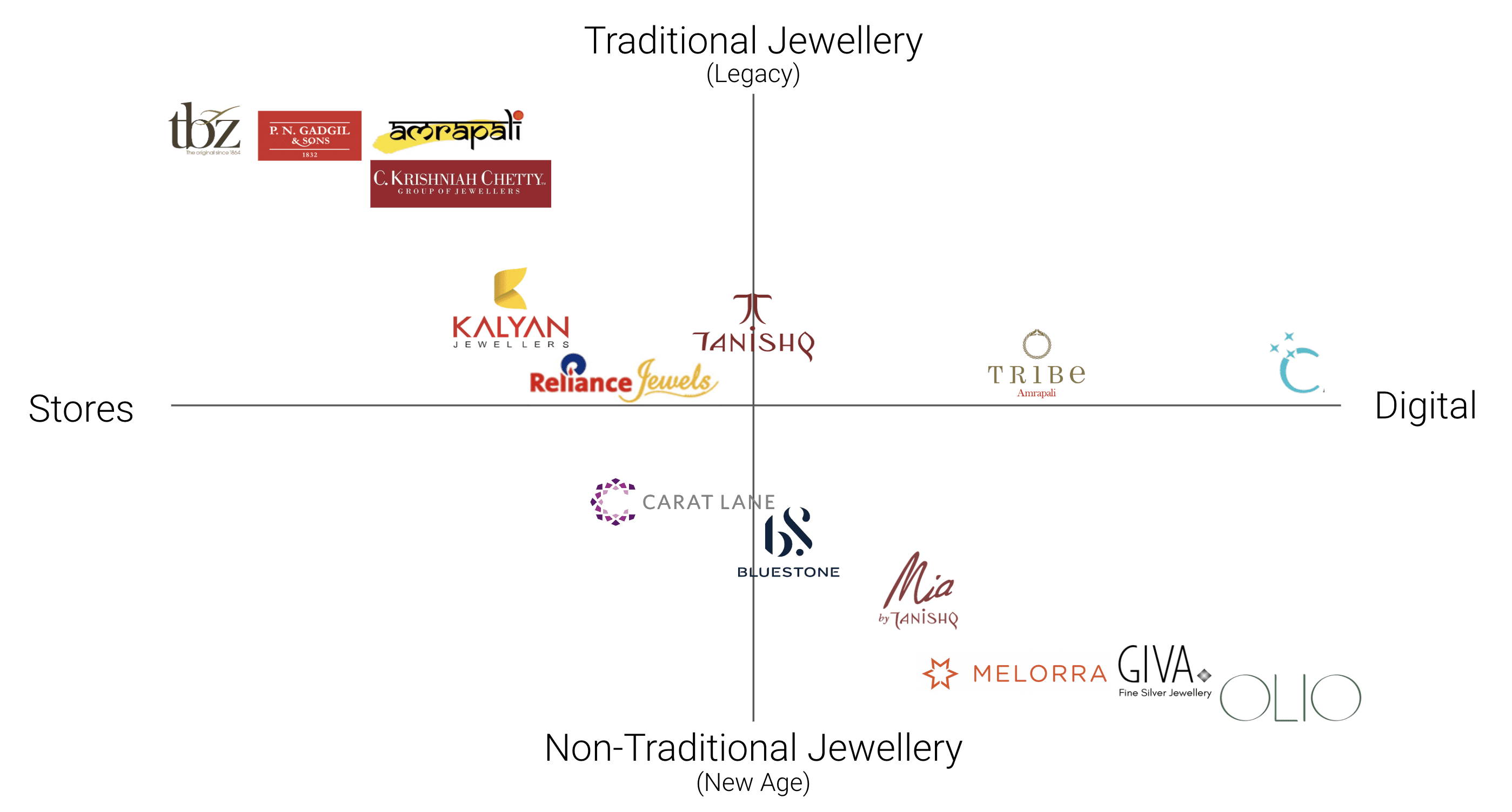
Competition in the Jewellery Market is Heating Up
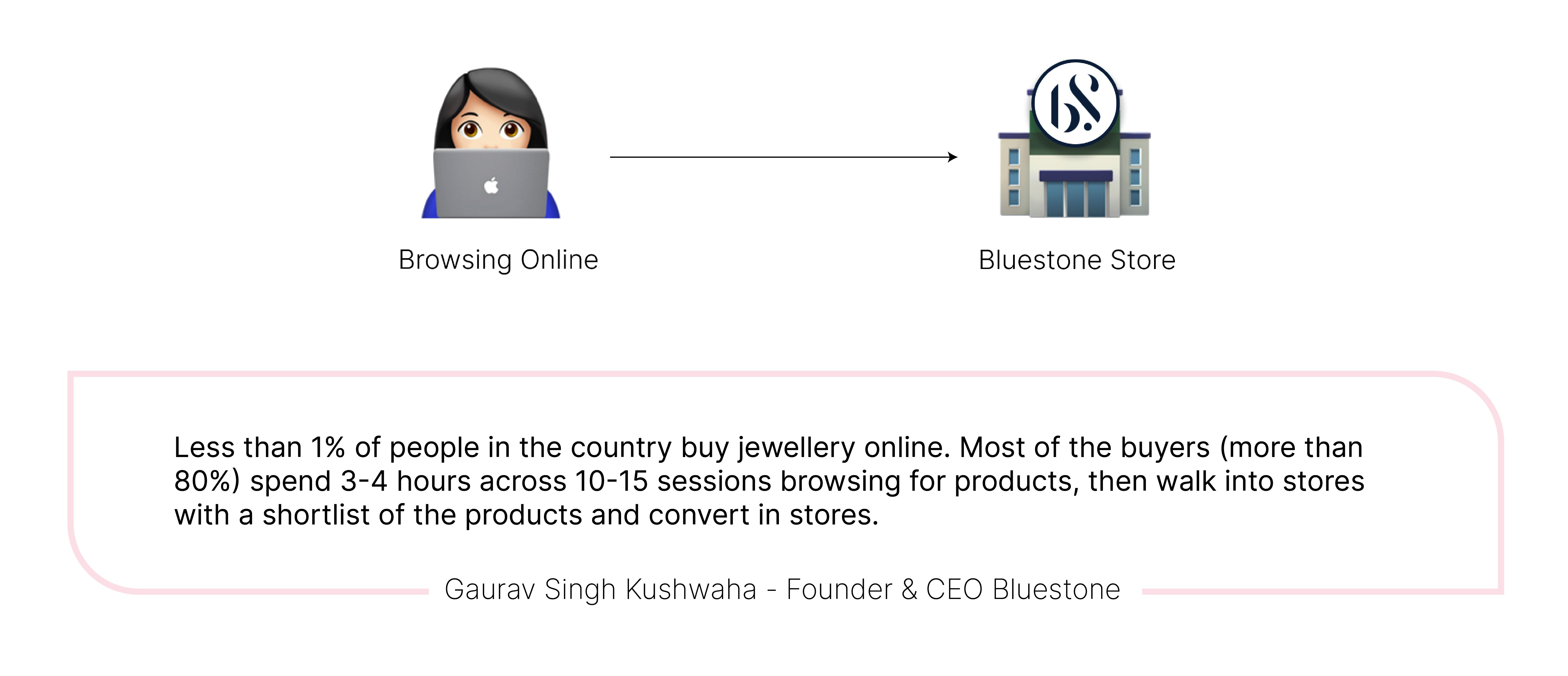
With the increasing demand for jewellery, many new players are entering the digital market, offering innovative and diverse styles at various price points. Established legacy brands are also stepping up by launching online stores to compete in this evolving market. As more companies embrace digital platforms, the jewellery industry is becoming more competitive than ever. Here's where Bluestone stands.
I am very particular about the product I buy. I will research online, go see & feel it in store and then buy it, often at stores itself.
— Prashant
I stumble upon a jewellery piece, I like it but often wait for an occasion to buy. However, at the end, the thought of buying is forgotten.
— Sneha
I would expect attention to details like recommendations, small personal touches, ability to enhance my gifting experience.
— Maitreyi
I was super overwhelmed when I had bought a gold necklace for my wife. Had shared the piece with Shreya and all my other friends and got a validation from them first.
— Nihar

Sitemap
As part of the process, we developed a simple site map to document the features for the pages we redesign. We have divided them into categories like discoverability, engage, entice and elevate.


Below is a video showcasing the entire product description page, along with a Figma prototype link for a detailed view.


